Dark horse: The rise of dark mode
Dark horse: The rise of dark mode
Google has turned to the dark side. The tech giant has finally made a ‘dark mode’ option available for Google Search on desktop – and if you want to keep users of your website or app happy, it’s time for you to go dark, too.

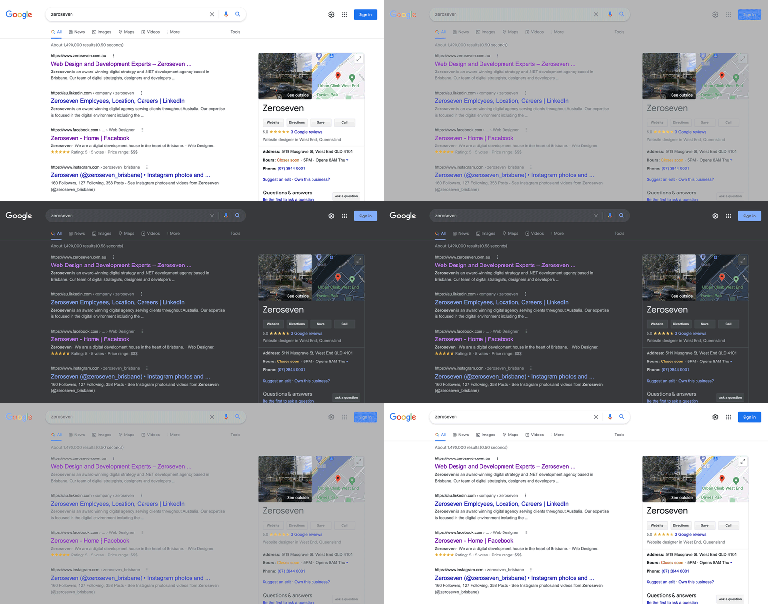
For the uninitiated, dark mode is simply a light-on-dark colour scheme that inverts the default setting on most devices, which is to display dark text on a light background. When you switch to dark mode, dark text becomes light, and light backgrounds go dark.
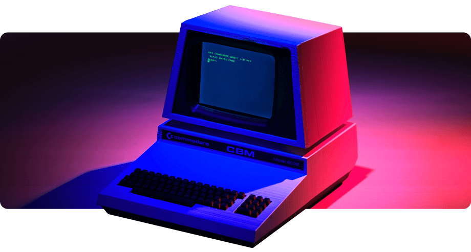
The earliest computer screens were set to dark mode by default, with white, green, blue or amber text displaying against a black background. But with the advent of word processors, which were designed to simulate the look of ink on paper, the dark-on-light colour scheme became the dominant one. Even so, dark mode remained popular among developers viewing code – think Neo in ‘The Matrix’, with his light green text on a black background.
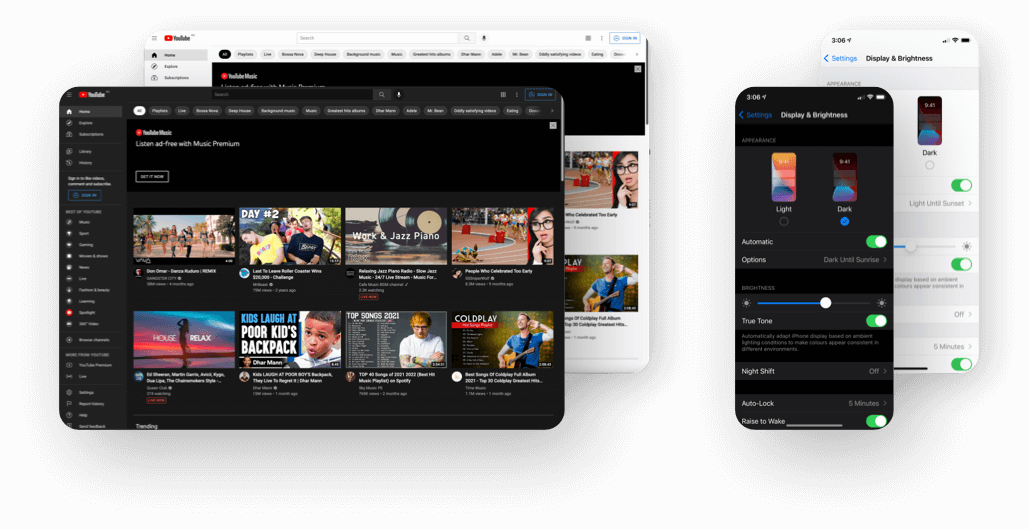
In recent years, however, dark mode has made a comeback outside the coder set, with numerous websites, apps and operating systems adding dark mode options. In 2019, Apple announced the availability of dark mode across all native applications in iOS 13 and iPadOS – this seemed to be a watershed moment for the feature, which is now available on Android phones, Apple’s recent operating systems, Safari, Firefox, Microsoft Outlook, Reddit, YouTube, Gmail and so on.
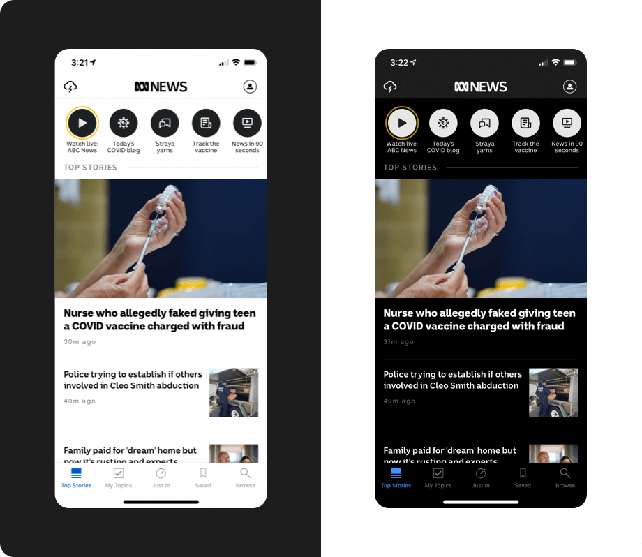
Apps that make effective use of dark mode tend to give users the ability to either follow the preference of their operating system and switch from light to dark as day turns into night, or override their device settings and control the switch directly through the app. In Australia, for instance, that’s how news apps like ABC and SBS have enabled the feature, which is intended to keep users scrolling through their feeds long into the night. (A list of apps that support dark mode can be found here.)
It’s this spike in the popularity of dark mode that has convinced Google to finally add the option to Search – you can enable it by going to Settings > Search Settings > Appearance. Of course, users who were truly committed to dark mode could already turn the lights out on Search by using browser plugins, but the fact that it’s now available on the most dominant search engine without having to install an extension will only add to the ubiquity of dark mode.
What are the benefits of dark mode?
There are a number of purported benefits of using dark mode, some of which are demonstrable than others.
One clear benefit is that light-on-dark colour schemes reduce power consumption on OLED displays, which virtually all mobile devices come with now. That’s because, in an OLED (organic light-emitting diode) screen, each pixel lights up individually – so when a pixel is black, it doesn’t require any energy to activate. For this reason, using dark mode is a great boost for the battery life of these devices.
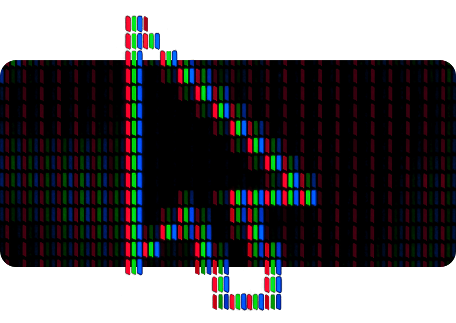
If you’re using a device with an LCD (liquid crystal display) screen, like most Apple devices before 2020, you won’t save any energy by using dark mode, because these screens are backlit – so whether your background is light or dark, the pixels will always light up, and subpixels then either block the light or allow it to pass through.
Proponents of dark mode also claim that the light-on-dark display reduces eye strain, because it cuts down on blue light exposure and increases the contrast between the foreground and the background. This seems logical enough, but there’s no definitive evidence to prove that dark mode does this.
It’s also been asserted that dark mode can help restore circadian rhythm and improve your sleep, but a 2019 study of Apple’s dark mode settings found there was no noticeable difference in melatonin levels between people who used the feature and people who didn’t.
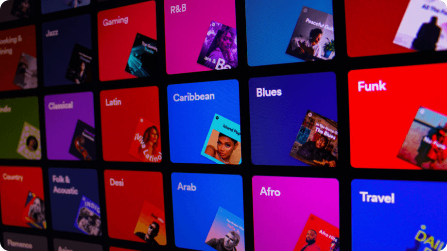
Regardless of the health benefits (or lack thereof), it’s clear that many users simply have a subjective preference for the aesthetics of dark mode. Twitter was forced to roll out a ‘true’ dark mode called ‘Lights out’ after users complained that its dark mode wasn’t dark enough, and Spotify went so far as to make a light-on-dark colour scheme its default, after test users overwhelmingly favoured the way that album artwork and navigation buttons popped against dark backgrounds.
Dark mode for developers and designers
We seem to have reached a point where if you don’t optimise for dark mode, you’re just not keeping up.
But for developers and web designers, this has been an issue, because the internet as we know it wasn’t built with dark mode in mind. Most pages on the web are designed for light backgrounds, and when they’re automatically converted to dark mode, the inversion of light to dark colours can prevent graphics from displaying properly, and lead to a visual mess that’s the furthest thing from aesthetically pleasing.
In the example below, you can see an automatic colour conversion on the Aussie Broadband website results in colours that are off brand.
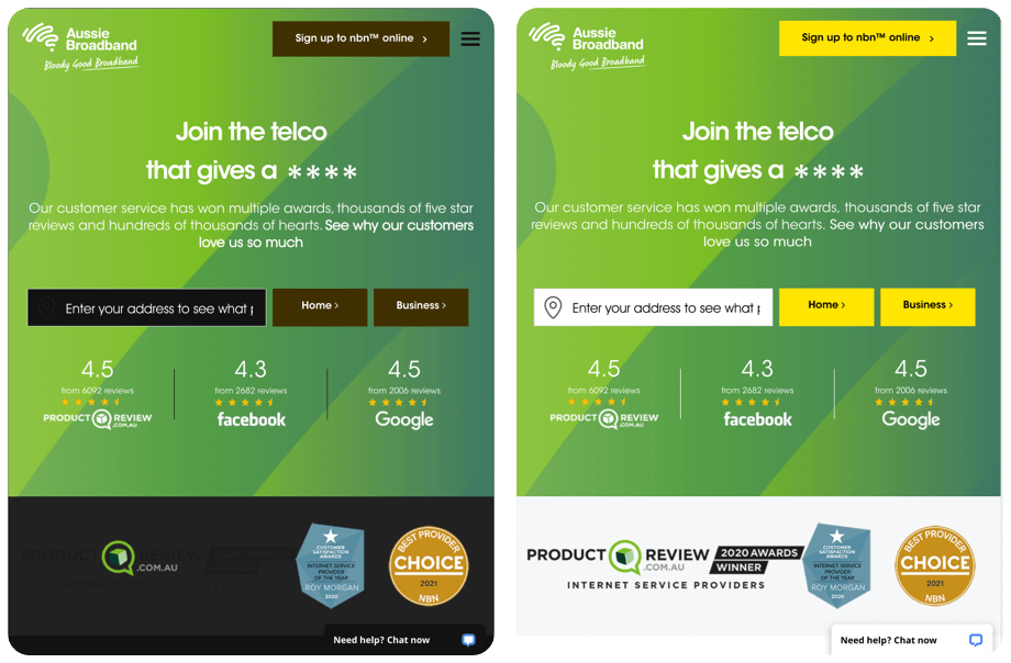
That’s why, since 2019, a prefers-colour-scheme feature on CSS has been available that makes it possible to detect if the user has requested a light or dark colour scheme, and serve the requested scheme accordingly. Essentially, pages are required to be designed with both light and dark mode in mind, and the light or dark theme will then be displayed based on the user’s preferences.
Emails present another challenge, however, because while virtually all the major email clients have some kind of dark mode setting, they all render dark mode a little differently – it’s not a universal setting that’s always applied the same way.
Some email clients will respect prefers-colour-scheme code, but others, like Gmail, won’t. Some will display an email the same way whether light or dark mode is on, and others will automatically invert colours to make the background dark, which can lead to logos and images getting lost and your emails becoming hard to read.
You can’t just ignore that many of your subscribers will be viewing your emails in dark mode, because if you routinely send them emails that may as well be abstract art, they’re going to ignore them, delete them, or unsubscribe altogether.
Luckily, there are a few steps you can take to optimise your emails for dark mode, no matter how your subscribers’ fickle email clients choose to display them.
- Use PNGs with transparent backgrounds. That way, no matter what colour the email client changes the background to, it’ll be reflected in your graphic elements, making them appear seamless and natural.
- Consider how dark design elements will render. For example, a black logo on a white background with rounded corners will prevent a disappearing act when forced to appear against dark backgrounds.
- If appropriate, consider sending plain-text emails. This won’t be possible if you have a variety of design elements you want to include in your emails, but if you’re just trying to get a straightforward message out to your subscribers, this is an easy way to bypass the vagaries of dark mode. No matter which email client is displaying a plain-text email, it’s difficult for them to screw it up – black text will just become white and a white background will become black. Simple.
- Test and test again. Most email marketing platforms will enable you to test how your messages render in light and dark mode across a variety of email clients and devices. If you don’t have access to that sort of tool, the lo-fi way to do this is simply to set up email accounts across a range of providers and devices, send the email to yourself and take a look how it displays across the board.
Below is an example of how we were able to consider automatic colour conversion in emails, to avoid poor results.
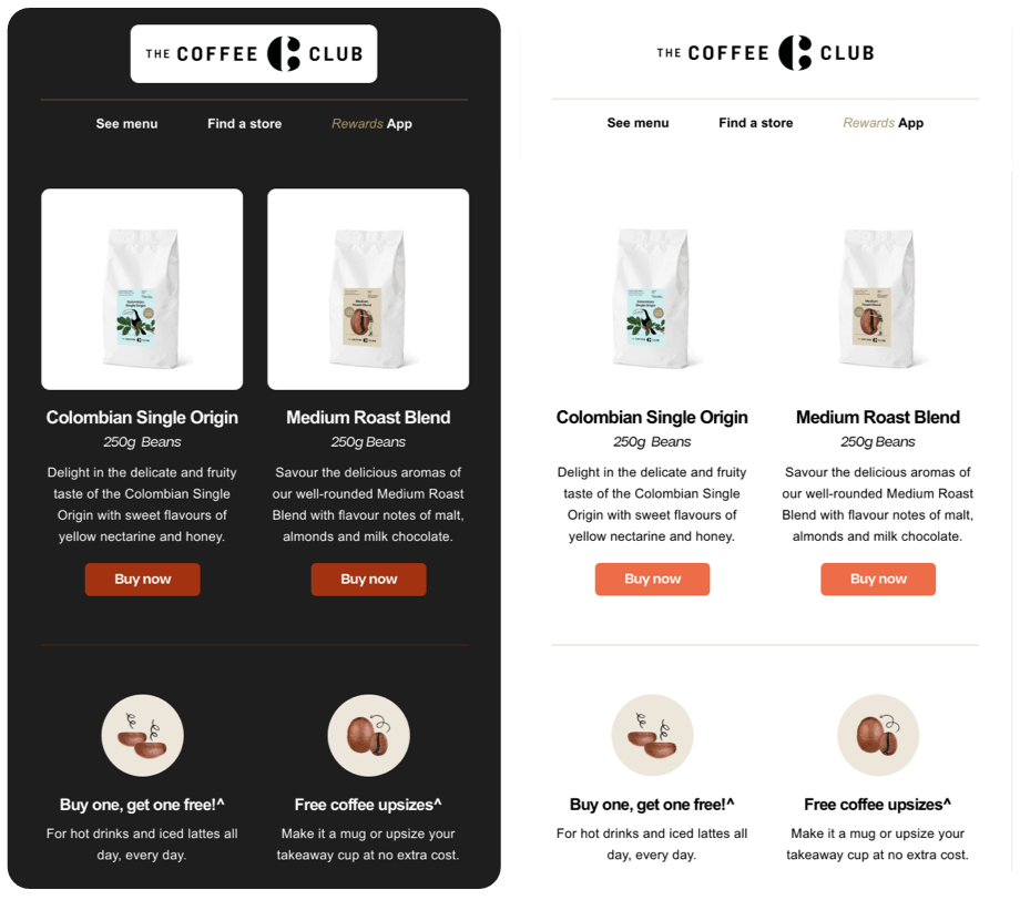
Ultimately, although the logistics of how dark mode is implemented differ across various email clients, operating systems, websites and apps, users don’t care about that. They’ll simply expect a cohesive experience, from the moment they pick up their device to the moment they put it back down.
Everybody has a dark side – and now, so should every computing platform.
Zeroseven can help you to ensure your online presence is optimised for dark mode. Contact us to join the dark side today!
