

Learning new tricks with Goodstart
Off to a Goodstart
Learning new tricks with Australia’s largest early childhood educator
Goodstart Early Learning, Australia’s largest provider of early learning and care, worked with Zeroseven to build a new website that provides existing and prospective Goodstart families and staff with an optimal and intuitive user experience.

A fresh start
With more than 660 early learning centres throughout Australia, and more than 60,000 children in their care, Goodstart Early Learning are dedicated to creating better lives through great early learning experiences.
Having already engaged Zeroseven to build Goodstart At Home, an engaging collection of activities to help families enhance their learning experiences at home, Goodstart worked with our team once again to rebuild the flagship Goodstart Early Learning website.
The initial impetus for the project was to upgrade the site, which was running on an older version of Kentico, to the latest version of the award-winning digital experience platform.
Goodstart and Zeroseven decided to take this opportunity to rebuild the site from the ground up, leveraging the enhanced performance of Kentico Xperience 13’s next generation ASP.NET Core MVC framework to create a superior user experience.
Looking to upgrade your digital experience?
Kentico Xperience is an award winning digital experience platform and Zeroseven is Australia’s premier Kentico Gold partner with an accredited in-house development team.
First thing’s first
Working closely with Goodstart’s Digital Experience team, Zeroseven gathered information about what mattered most to users of the site.
Users from a large range of demographics visit the Goodstart Early Learning site – after all, people from all walks of life need child care and education. The site needed to cater to all of those potential customers, as well as to existing Goodstart families looking for information about their local centre, and to prospective staff.

Zeroseven developed wireframes of the new site’s layout in consultation with Goodstart, before developing high-fidelity prototypes for extensive user testing and refining. Ultimately, this ensured the site’s design and information architecture were reviewed and tested thoroughly by Goodstart and their users, undergoing numerous iterations before arriving at their final form.
The resulting design saw the most popular and important features of the site – including the ability to find a centre, book a tour, and learn about career opportunities with Goodstart – featured prominently on the homepage.
Drop-down navigation menus were carefully designed to prioritise quick links to highly sought-after pages on the left, with featured items in the middle and relevant calls-to-action (CTAs) on the right.
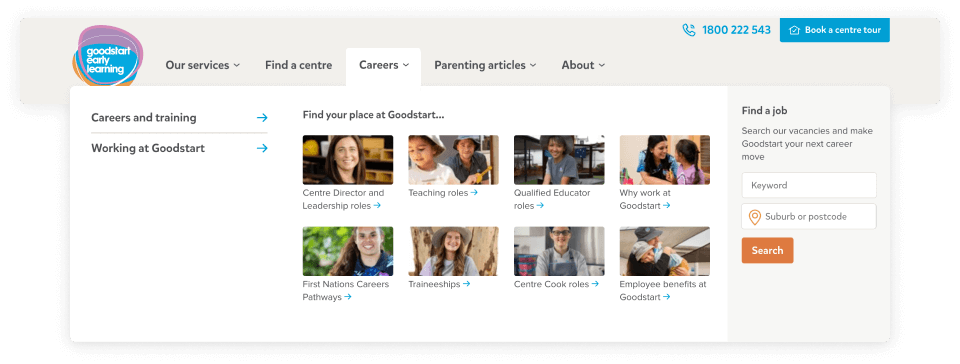
The ‘Careers’ tab, for instance, uses this space on the right to enable prospective staff to search for jobs in their area and join Goodstart’s talent community without even needing to visit the ‘Careers’ page.
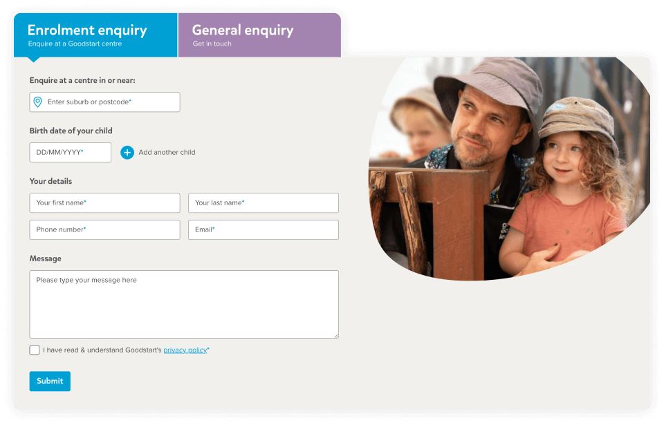
A multi-tab quick enquiry form was also added to the homepage, to ensure that both parents and job seekers were catered for.
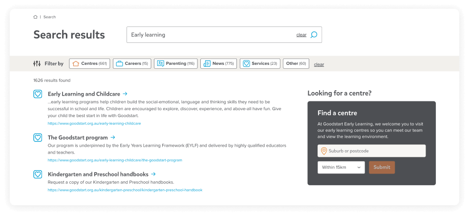
Site search functionality has also been greatly improved, with filters applied to ensure the most relevant results from Goodstart’s vast content library are shown first. These results are displayed with icons to indicate the different types of content being shown.
The site also goes beyond regulatory requirements for accessibility, and complies with Web Content Accessibility Guidelines (WCAG) to ensure screen reading programs can successfully navigate its content, improving the experience for users with disabilities.
Centres of attention
A key insight that came from user testing was that people wanted to be able to find information on specific Goodstart centres quickly and easily – whether they were searching for details about the centre their children were already attending, or finding a new centre for their family.
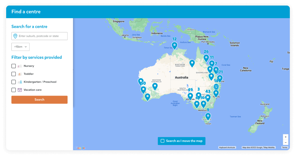
As a result, Zeroseven added quick links and CTAs for the ‘Find a centre’ page throughout the site, and developed an interactive map of all the Goodstart centres throughout Australia. Users can find the right centre for them by typing in their suburb, postcode or state; choosing the size of their search radius; and filtering centres by the services they provide (i.e. whether they offer nursery, toddler, kindergarten / preschool and vacation care services).
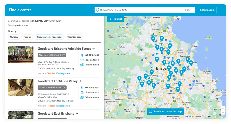
Users are then presented with both a list of the centres that meet their criteria, and a map displaying their locations. The list includes the key details that test users said were important to them – including the centre’s address, phone number, opening hours, the services they provide, and the ability to book a tour – so that busy parents who are in a hurry can access that information immediately, without needing to click through to that specific centre.
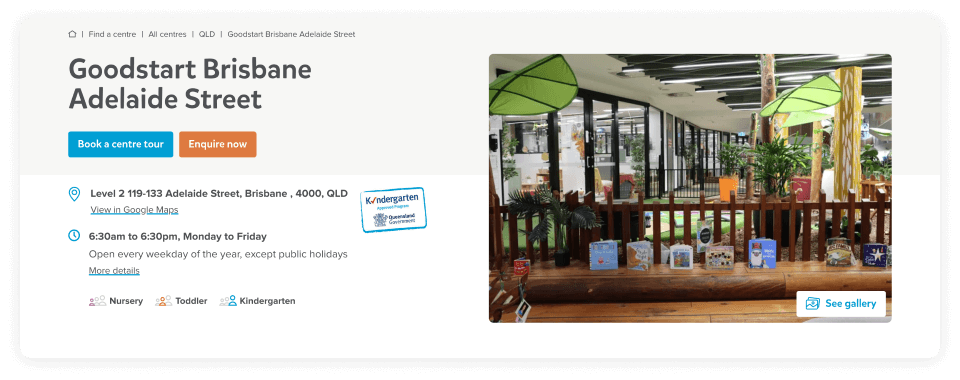
When users click through to a specific page, they can see a detailed description of each centre, as well as a profile of the Centre Director, and specific fees and inclusions for that centre, using data pulled from a central management system. Each centre has its own photo gallery, with one image highlighted at the top to enrich each page. These pages act as hubs for each of the 660+ Goodstart centres throughout Australia.
There are subtle differences between how the centres display – for example, Queensland centres offer a ‘Kindergarten’ program, whereas New South Wales centres offer a ‘Preschool’ program and Victorian centres offer a ‘Kinder’ program. Individual centres also display different accreditation logos, depending on their location and their certification level.
Taking advantage of Kentico’s reusable content feature, the ‘Find a centre’ and ‘Book a centre tour’ CTAs and forms that appear on multiple pages throughout the site can be updated in just one place, and those updates will then be made everywhere they appear.
According to our calculations
A particularly popular feature of the site is the Child Care Subsidy (CCS) Estimator, which calculates the amount of government support a family could be eligible for when their child attends a Goodstart Early Learning centre. This feature is in the spotlight at the moment, with changes to the CCS coming into effect in July.
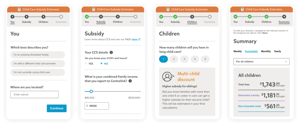
As part of the new site, Zeroseven rebuilt the existing CCS Estimator, undertaking extensive user testing and iteration to determine the simplest and most straightforward line of questioning for families that would yield an accurate result.
At the same time, the new estimator factors in variables that hadn’t previously been considered, such as the multi-child discount that enables families to receive a higher subsidy for siblings.
The estimator utilises an application programming interface (API) enabled by Zeroseven to access the data required to calculate the results, including the current percentage of fees covered by the government depending on the user’s income, and the fees for the specific Goodstart Early Learning location chosen by the user.
The estimator then completes complex calculations to display the total fees the user can expect to pay, the subsidy they can expect to receive, and the out-of-pocket costs that will be left over, before encouraging them to book a tour of their chosen centre.
Educational content
As well as providing a better experience for current and prospective Goodstart families, it was crucial for the Goodstart team to be able to update and add new content to the new site with ease.
The first step in this process was content migration. With no direct upgrade path from the older portal engine model that the previous iteration of the Goodstart site was built on to the new .NET Core, a significant amount of content – including more than 1,100 news articles – would need to be recreated on the new site. Content from another Goodstart site, First Five Years, also needed to be brought over to the new flagship site.
Rather than requiring Goodstart’s editors to manually re-enter all of that content into the new content management system (CMS), Zeroseven’s solution was to develop a custom tool to migrate the content automatically, mapping the various fixed components required by the rigid structure of the old site onto the flexible widgets of the new site.
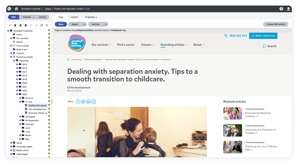
The Goodstart team can continue building on this content with Kentico’s modular Page Builder components, which enable them to create new layouts and add new content to the site with minimal effort.
Goodstart’s people – from the marketing and communications team to staff at individual centres, who may wish to update the content on their centre pages – can use intuitive drag-and-drop widgets to populate pages with text, imagery, videos, forms and more, and re-use content from other pages as required.
Importantly, Zeroseven provided Goodstart with a tailored CMS experience. Goodstart’s people aren’t presented with any superfluous controls, and they don’t have access to anything that could conflict with the site’s overarching design principles.
Instead, they access only what they need to upload and update content without any technical skills, with advanced workflows to ensure changes are reviewed by the necessary editors before they go live.
This enhanced editability extends to the CCS Estimator. The wording users see when they make use of the estimator was previously hardcoded, and required a developer to change, but can now be adjusted by the Goodstart team themselves as required.
Learning by design
The look and feel of the new site needed to reflect the inherent playfulness of the Goodstart brand, while still projecting the professionalism that parents would expect from a business they’re entrusting their children with.
Zeroseven’s solution for straddling this line was a restrained and strategic use of the familiar blue, purple and orange colours in Goodstart’s logo; employing these colours and shapes sparingly but effectively to highlight and emphasise CTA buttons throughout the site.
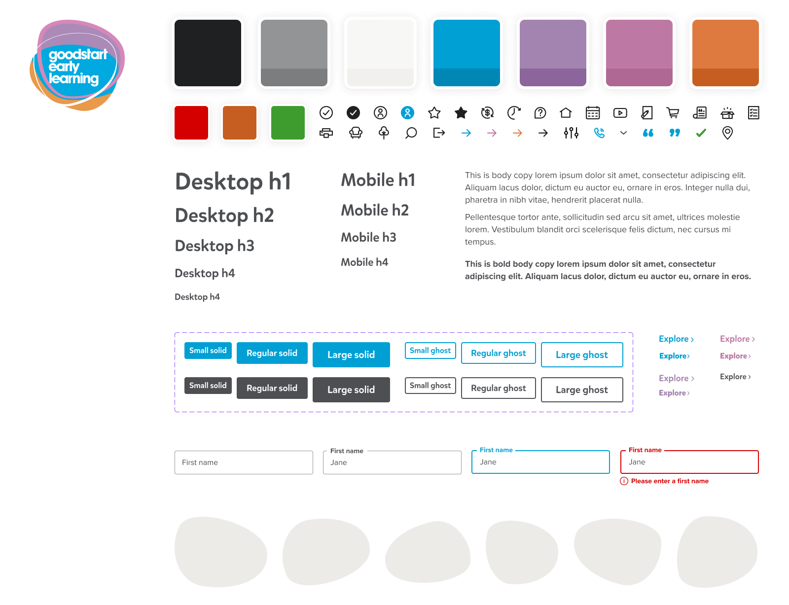
Similarly, the ‘stepping stone’ shapes found in the Goodstart Early Learning logo were deployed subtly to draw attention to page headings and CTA banners, injecting just the right amount of Goodstart’s brand personality without overwhelming the design.
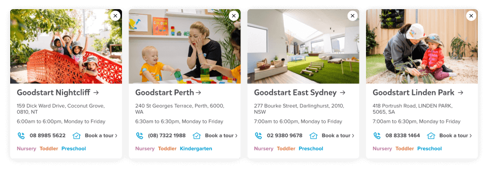
The site also makes use of bright, colourful photography, conveying the vibrancy of Goodstart’s centres through this imagery while allowing the surrounding interface to remain relatively subdued.
In safe hands
Leveraging Kentico’s native support for Microsoft Azure, the new site is built on a secure and serverless deployment architecture.
This serverless solution auto-scales effortlessly, which means the new site can dynamically scale to accommodate increased site traffic and performance demands. Serverless deployments also remove certain IT risks and overhead costs that come with having a website deployed on-premises.
The Kentico platform also leverages authentication methods and permissions to protect the information that Goodstart’s families and other users have trusted them with, with multiple security layers separating data, administration and the live site from each other.
This means the Goodstart team can rest assured their website is protected – so they can focus their attention on giving Australia’s kids the best possible start in life.


