|
8 min read
There and back again - a user's tale
There and back again - a user's tale

I do almost all of my Internet browsing on my mobile - my beloved iPhone 4S. We are joined at the hip. Whether train, couch, shopping centre bench, or airport terminal, there's nothing more convenient than being able to Google this, Facebook that, and stay up to date with the world on the fly. I love it.
It doesn't mean I don't use my desktop. I use it quite a lot. Just not as much, any more.
So as someone who virtually lives on their mobile, I find myself constantly frustrated by the limitations of and decisions made for me by a lot of mobile websites.
The reason for the experiences I've had on mobile websites being so poor is, I believe, because the world believes that mobile users and desktop users are different people.
We're not. We're just users. We visit the same website on mobile, desktop, eReader, tablet, television and airplane entertainment system.
What's wrong with thinking about mobile users separate from desktop users?
Users consider a brand's website a single entity, regardless of the version they happen to be looking at. So it's only logical that we think that way in return. We should think of users as a single entity, not categorise them into device-users and desktop-users.
Let me explain...
1 / The mobile website impedes functionality otherwise available on desktop
The example I'm going to use is Facebook mobile (not the iPhone app - the mobile website. That is, the version of Facebook that loads if you open Safari on your iPhone and type in facebook.com. This request redirects you to m.facebook.com, their mobile version).
While I'm commuting, one of my morning routines is to post links that I find around the web on my Facebook feed. It generates some really good conversations with my friends.
When you share a link through Facebook for desktop, by pasting the link into the status bar, it displays a preview of the link, with title, summary text, and your choice of thumbnail images. You can update the title and summary text if you wish. If you don't like the image it loads automatically, you can scroll through any other available images from the website you're linking from, or choose to display the link without an image.
If I follow the same steps on Facebook mobile - that is, paste my link into the status bar - I don't get any of these options.
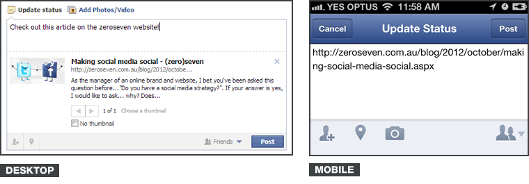
Furthermore, it leaves the actual link in the status bar. If you remove it, the link isn't attached to your status at all. All the display options of title, summary text and thumbnail image are auto-generated.
Facebook makes the decision of how it displays on my feed after I select the Post button and it ends up being a less than perfect user experience. If I share a link through Facebook mobile, I won't get any feedback from it, because visually, it renders badly for my Facebook friends and I end up looking like a noob.
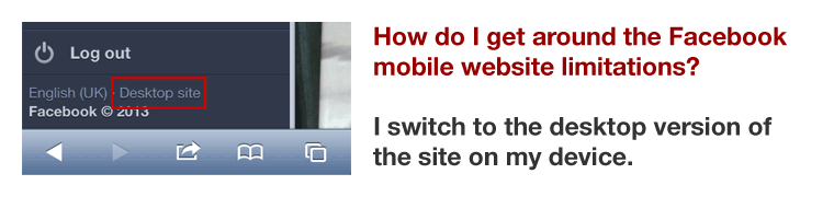
I actually have the desktop version of Facebook saved as a bookmark in mobile Safari, so I never have to use the mobile version, because I find the limitations of their mobile website so frustrating.
If you need a mobile website, ensure that functionality available on the desktop site is accounted for in the mobile version.
2. A page I read on the desktop version is hidden to me on the mobile version
Mobile versions of websites have largely been considered cut-down versions of the full website. They are intended to deliver only the "truly important" content to the user. Similar to the previous point, where functionality the user is familiar with is hidden, this point looks at the equally frustrating hiding of entire pages of content on your mobile website.
The problem is that an individual can't answer what "truly important" means from user to user. You don't know how each and every user browses your website, and by making the assumption for them and deciding what is important, then hiding the rest, you create friction, particularly if your website is one regularly visited by that user on both desktop and mobile device. Information your user could access yesterday is suddenly hidden from them. They don't care that yesterday they were on a desktop and today they're on an iPhone. As far as they're concerned, your website is a single entity; the mode of accessing your website is their choice and honestly, should be irrelevant.
How can you avoid creating this friction caused by hiding content? It's really simple. Instead of assuming what your entire user base will find important, provide all the same copy they would see on the desktop version. Let them decide what's important.
If you have to hide content on a mobile version, advise the user that the page they are trying to access is only available on the desktop version of the site, and give them the option of viewing it on that version. They might really need to access what you've hidden from them and not be near a desktop.
3. In most cases, mobile websites load after the full version of the site has downloaded
Have you ever gone to a website on your mobile and seen the full, desktop version of the site load for a moment? Then when you're about to start browsing, you're stopped - and the entire site reloads again, forcing the mobile version on you?
This happens because of how the check for mobile device has been implemented. In the background, it runs a query, and loads the mobile version of the site if it detects a handheld device like an iPhone or iPad. This switches to and loads the content, style sheets, images and whatever else the mobile version needs to display.
The problem with this is that the check is running after the desktop website has loaded, including all its content, style sheets, images and whatever else it needs. By then forcing me to the mobile version of the website, the website owner has just forced me to download twice the amount of content on a less-capable device. If I have already downloaded the desktop version of the site, show it to me. Don't take me to another version and make me download even more files when I'm running on mobile data!
One of the genuine reasons for building a mobile version of a website is to reduce loading time for device users on limited bandwidths. I can't think of a single mobile provider in Australia today that offers unlimited data plans. If a website forces a user to download the full version and then the mobile version of their site, they are not only costing them money, but the user knows that website is costing them money and frustration is born.
If you have a mobile version of your website, detect the device before loading the website.
4. If I click a link someone's sent me, I'm sent to the homepage
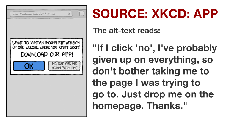
Have you ever clicked on a link someone's posted to their Facebook wall, or sent you in an email, that should direct you to a specific page on a website, and been sent instead to the website's homepage? This happens all the time to me when I'm browsing on mobile. The moment this happens, I close the offending website. I cannot be bothered trawling through the site's navigation to get to the page I originally wanted to see.
Why does this happen? Again, all I can assume is that it's the way the site detects and redirects users to the mobile website. But it's extremely frustrating.
If a user clicks a link to your site, take them to the page they requested.
5. Mobile styles are usually ignored when updates occur
Not always, sure, and that's why this is the final item in my list, but it happens. There are several blogs I visit regularly where I can tell they've not considered their mobile design or style sheet during their last round of rebranding. Images are suddenly too big and stretching the width of the page, page numbers are formatted badly and links are difficult to click without zooming all the way in, the header is hidden, the footer can't be accessed due to a continual scrolling script - the list goes on.
Once upon a time, I'm sure they had a beautifully running mobile version of their website. Now it looks outdated and forgotten. Their brand has been cheapened and looks unprofessional. It makes the mobile version of their website look like a fad.
If you're going to have a separate mobile website, make sure desktop updates have equivalent time allocated to update and test the mobile version as well.
The mobile website reality
A mobile website is an entirely separate website to the desktop version. As a separate site, it needs to be given all the time, energy and forethought that the desktop version had - not only to its design, but also to its development, usability, and future time for any and all website updates. A mobile website is a big decision. It can't be tacked on to the end of a desktop build as an afterthought.
This amount of attention required can create a massive, and somewhat unnecessary overhead, and alternatives should be considered.
One alternative to a mobile version of a website? A responsive layout. For a full definition, please see this article, Responsive Design.
Responsive design removes the need for a dedicated mobile website, because the single version just works on everything - mobile, tablet, desktop, television, etc. It removes the need for duplicating or hiding content, because there are no second, third or nth versions of the site.
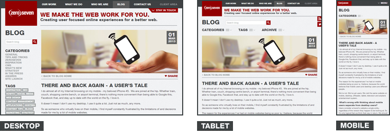
Browse a responsive website on your mobile, and you are viewing the exact same website that the desktop loads. It may look different - but all it is doing is shuffling the content around, using what we call media queries.
"Rather than looking for a type of device they [media queries] look at the capability of the device."
- How To Use CSS3 Media Queries To Create a Mobile Version of Your Website
by Smashing Magazine (incidentally, their website is a great example of a responsive website)
As a user, responsive websites make me happy. That a website has gone responsive tells me the brand behind the website cares about my experience, my bandwidth, and my choices. They're thinking about how their website works for people.
There's just one website to rule them all.