|
6 min read
Designing for thumbs
Designing for thumbs

Design is everywhere and there are many overlaps that occur between design disciplines. Often for mass manufactured goods - the speciality of industrial designers - anthropometrics are used to gauge the limiting user. The limiting user is the user that if you design for them, the object would be usable by everyone else.
This anthropometric gauge is measured in percentiles, for example, the 99th percentile. A great example of this in action is the designing of doors; where if you design for the tallest or 99th percentile individual it should (in theory) cater to and be usable by the rest of the population.
In web design, this approach has been true for a long time. The limiting user in this case has been the lowest resolution - or smallest monitor size that could connect to and view your website. Mobiles now make up this limiting user percentage with palm-sized displays now capable of accessing and viewing the entire World Wide Web. If websites were people, we would be trying to force them through a door a fraction of the size of what they once were.
It only makes sense then that we design for this limiting user, much in the same way we design for the tallest person. The 'mobile first' method of design is gaining popularity due to this idea of designing for the limiting user. Mobile first requires you to address usability and functionality constraints of the limiting user first to ensure that it is usable by the rest; in this case, for all the different screen sizes.
Content first
If you have ever used a website or application optimised for smaller screen sizes, one thing becomes clear; there is a lack of visual clutter. Designing for the limiting user often forces important aspects of a design to bubble to the top, and in the world of web design the most important thing is content.
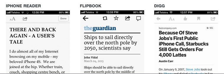
View any responsive or mobile-specific website and you will see this trend for yourself. Often superfluous elements and visuals are obscured or removed completely from the smaller canvas. Applications like Digg, Flipboard and even the built-in Safari Reader on iPhones go a step further and strip away the visuals of a website entirely, leaving the user with nothing but the content.
You might be asking now, how do you give a website personality and an appealing aesthetic without this added chrome and visuals?
The answer is to design your content.
Print designers have been designing content for years, utilising rich content to decorate the experience. Beautiful typography that reflects the theme of the content and elegant use of colour can give a visual style to content even on screens the size of your palm. Flick through magazines or newspapers and you will see this in action.
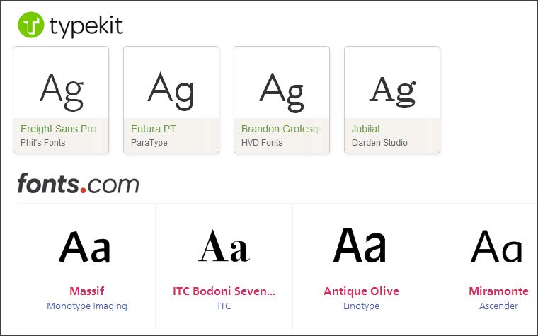
With the advent of web fonts and a variety of new code-based styling techniques now available, the designing of content approach is possible; fonts once relegated to print only have become available for web use. Services like Typekit and fonts.com provide the ability to serve famous fonts like Univers, Helvetica and Futura that can add character to what is now a very small canvas. Additionally companies like Adobe are putting forward web standards like CSS regions that could even make magazine style layouts possible.
Maintaining usability - tactics for designers
For years, the mouse cursor has allowed the precise selection of elements within the web. With the advent of touch-enabled, internet-ready devices, this variable has changed; we are now designing for thumbs. So handheld, touch devices are the new limiting user in two ways; first, the size of the screen is the smallest, and secondly, the interaction method is the largest. Sounds difficult to solve, doesn't it?
Major manufacturers of mobile operating systems provide suggested hit areas (an interactive area) for the best experience. Apple suggest a minimum of 44x44 pixels while Microsoft suggest no smaller than 32 pixels. As Anthony T for Smashing Magazine wrote, many people use their thumbs to navigate through their mobile devices, so this information is based on the hit area for index fingers. The thumb in this case is again the limiting factor as it is the largest finger, requiring the largest hit area. Smashing Magazine suggest an area of at least 72 pixels or 2.5 centimetres. This ensures that both the button/hittable area are easily tapped, and the visual response of the button is visible, so the user knows the area was successfully hit.
Creating hit areas large enough for users on touch devices has an added benefit up the usability chain. People using the traditional mouse cursor on a desktop will experience faster and clearer interactions while users of any touch device, from tablets to smart phones, will enjoy usable interfaces.
Managing complexity - the juggling act
Navigating a web site on a mobile device can be challenging with screen real estate being so limited. Often navigations are hidden or reduced in size to allow for content to become the priority. Managing the layout and usability becomes a juggling act between usable functionality and usable content.
Iconography
If you have spent any time navigating through websites or applications on a mobile device you would have encountered the "hamburger icon" - three parallel lines representing the menu, which is revealed once interaction takes place. This icon has become a staple of mobile applications and websites. Major websites such as Facebook and Google use it on their mobile websites and applications. YouTube goes as far as to hide the navigation and replace it with the hamburger on their main desktop optimised website..
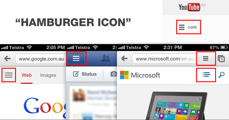
Icons can be an effective way to save space and communicate rudimentary functions quickly and easily to a user. It is important, however, that a function is not oversimplified or used incorrectly. A user who has never encountered the "hamburger icon" may be unaware of its meaning and would require additional labels to further explain its function - much in the same way the depiction of a floppy disk has come to represent the save function, despite younger generations not being aware of its literal meaning. Symbols like the "hamburger icon" may become synonymous for "hey there is a menu hiding here".
Navigation patterns
Dealing with navigation, and the space and forethought it requires for a web site, has become a problem when designing websites optimised for small resolutions. Various patterns have emerged as viable solutions for dealing with the lack of space on low resolution devices.
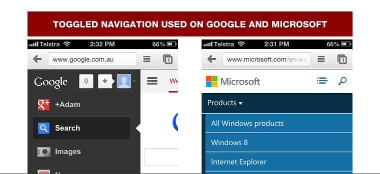
Hiding navigation elements within a toggle or drop-down has become a popular method of reducing the real estate required for large navigations. Microsoft recently converted to a responsive redesign and have hidden their extensive navigation within an extendable menu on smaller screen sizes. Alternatively Google has taken an approach similar to the method popularised by Facebook in using the fly out navigation.
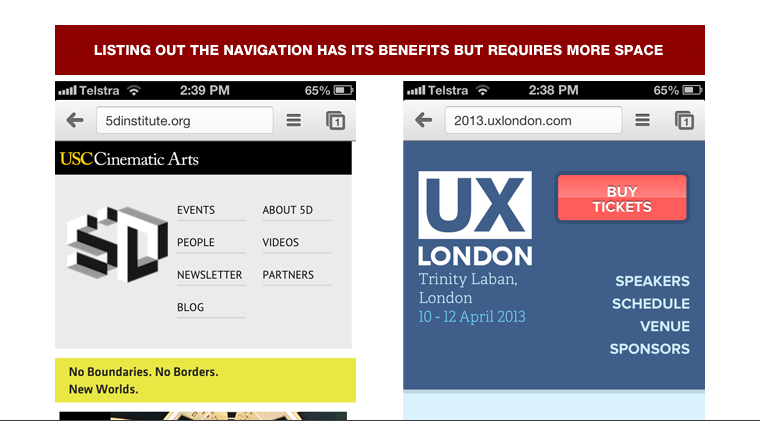
Hiding navigation can have its benefits, particularly for sites with large navigation structures, however, because they are not visible, these elements can be lost to the user. A more visible approach is to simply list the navigation. This is a popular method for smaller websites as it makes all navigation elements immediately visible without cluttering the layout.
Creating or using design patterns relies heavily on the idea that a user has already experienced and understands it. Like any new experience, a degree of discoverability can be expected so long as there is a hint to what interaction should occur.
Not the mobile user, the limiting user
The concept of mobile first design is fairly new but the ideology behind it is one that is applied to all design disciplines. The attitude should be "design for the limiting user" for any and all user centred design. Usability constraints exist everywhere with physical and psychological constraints giving boundaries to how a design should function and look.
In the end, it is important to remember that we are designing for people, not devices.